Queen City Brewery
"World-class beer without the jet lag"
Challenge
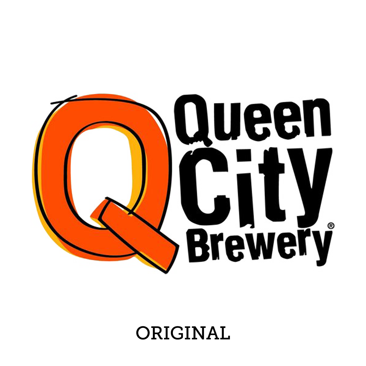
Queen City had built a reputation on traditional European style beers, but the identity did not match. The palette leaned hard on black and orange, and the whole look read more playful than what was actually in the glass.
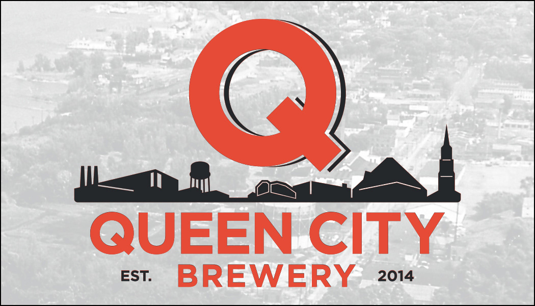
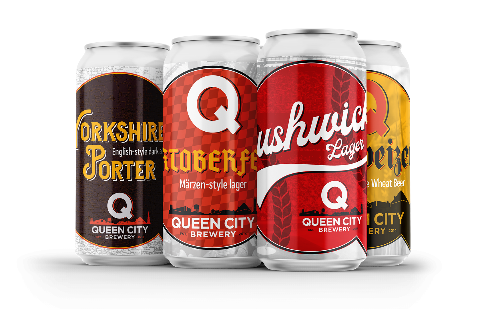
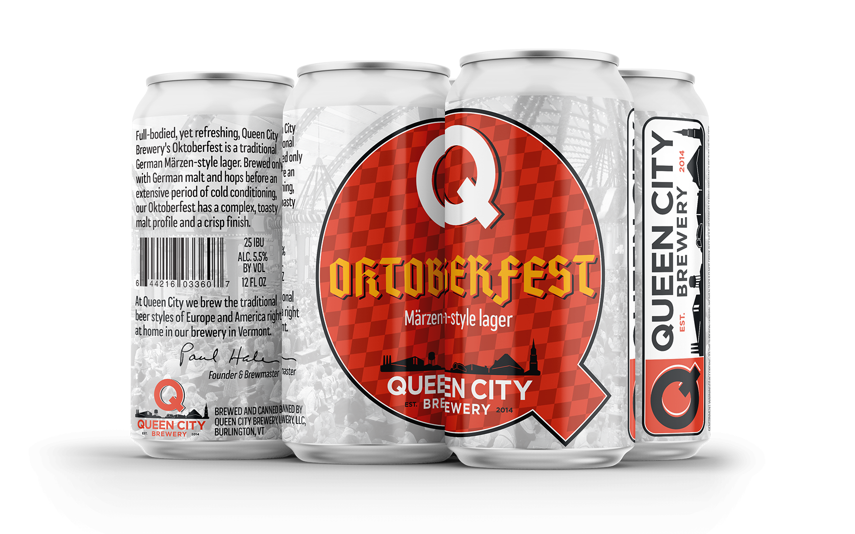
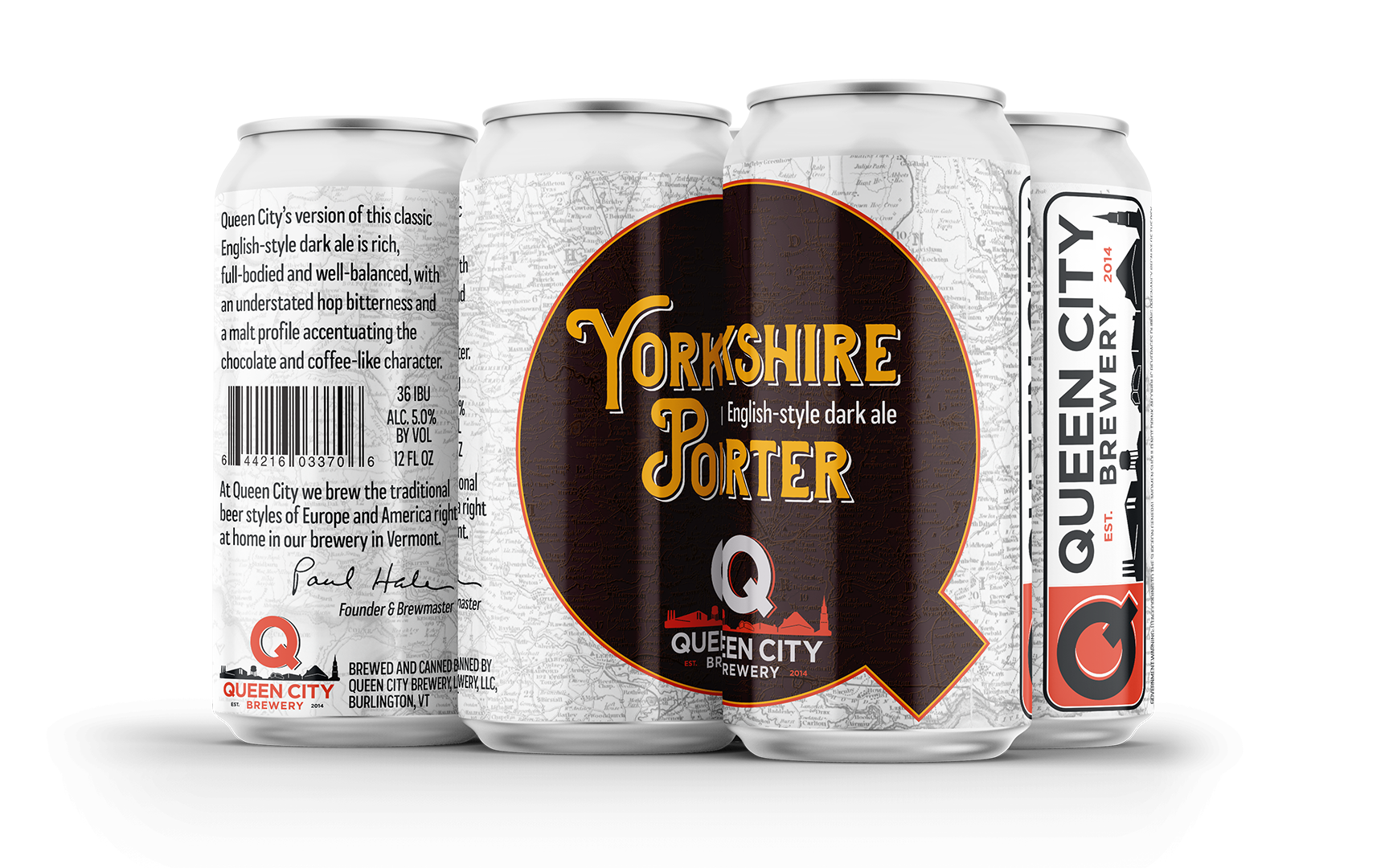
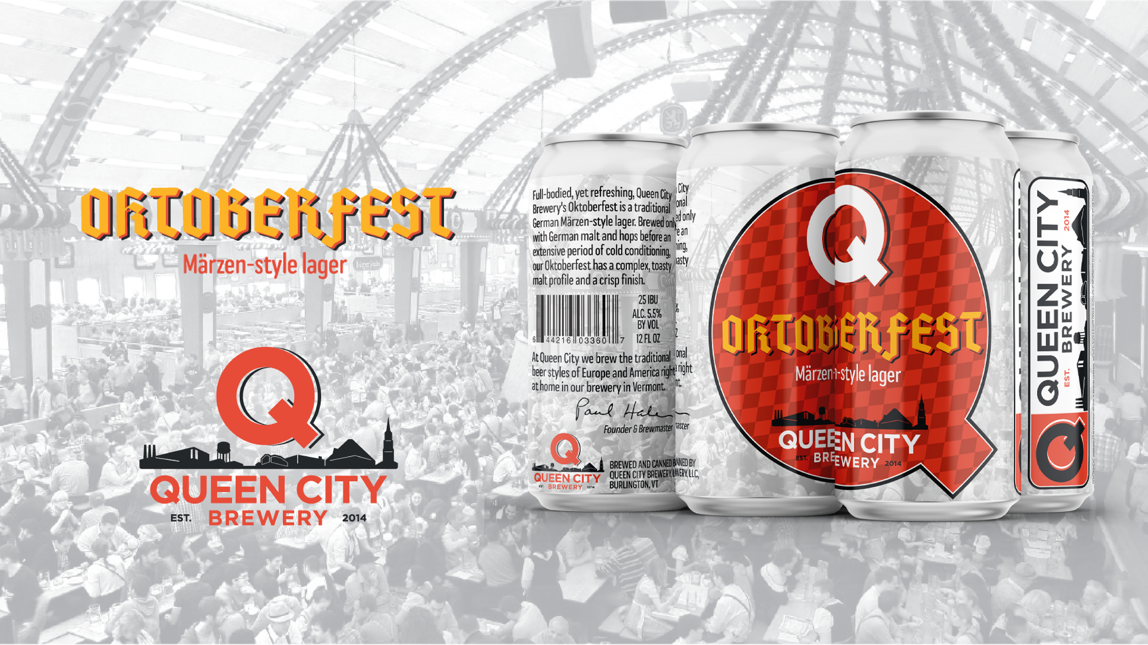
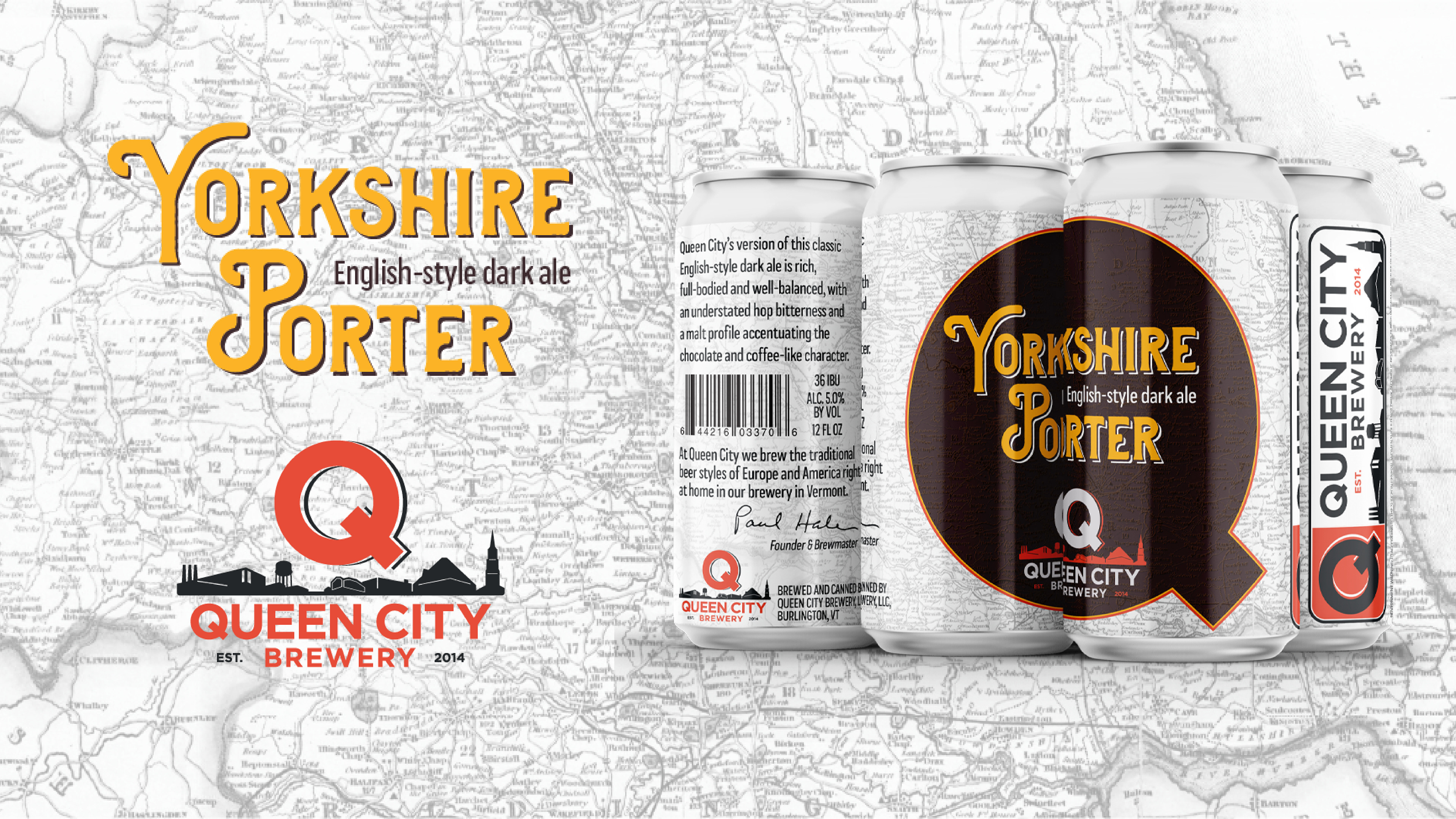
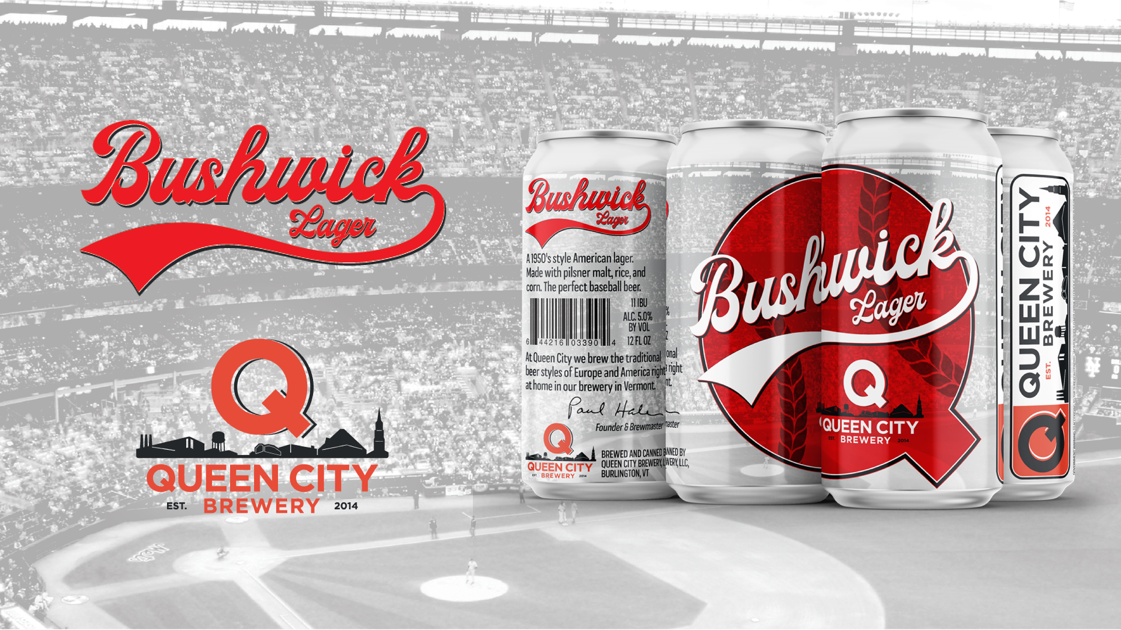
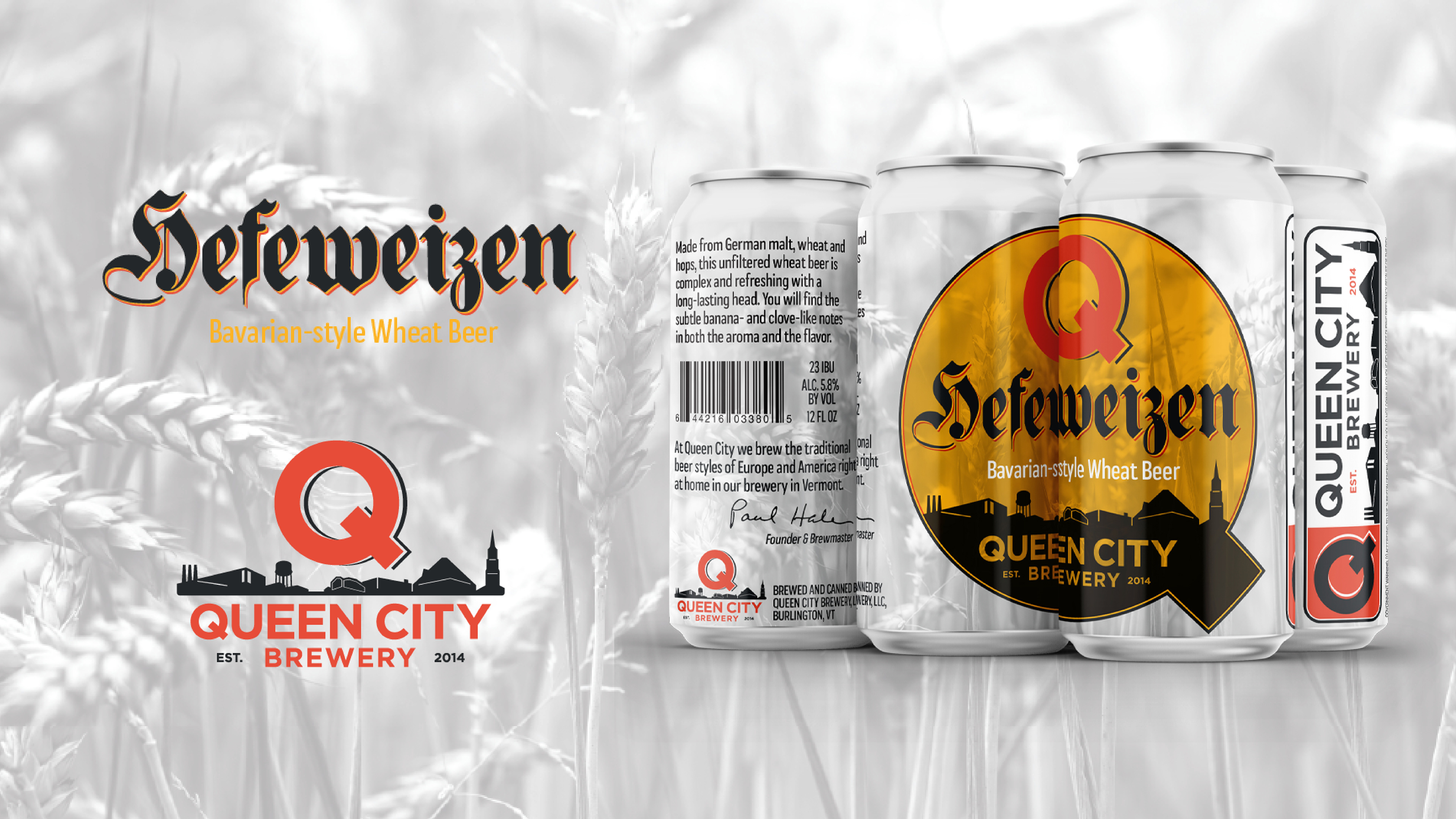
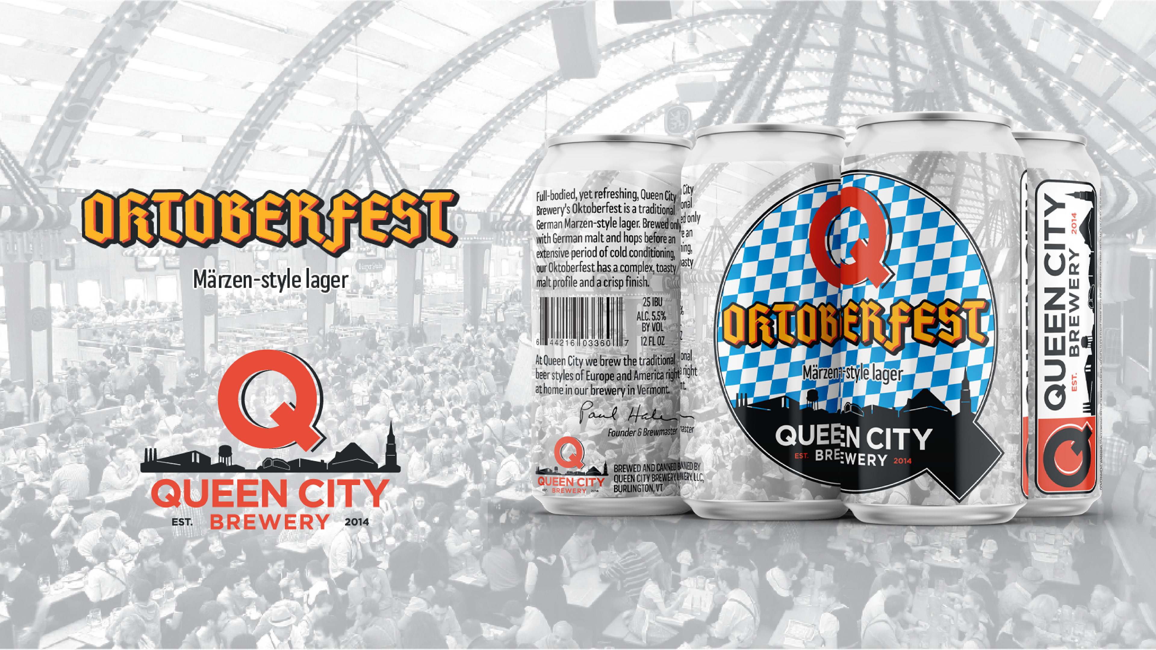
I rebuilt the brand system from the ground up and carried it across packaging, signage, collateral, stickers, banners, and a new website. The goal was an identity as considered as the brewing.
The result is a cohesive, professional identity that finally does the product justice, from the label to the taproom.
Deliverables
Strategy
Identity Design
Collateral
Web Design & Development
Packaging
Signage
Stickers
Banners
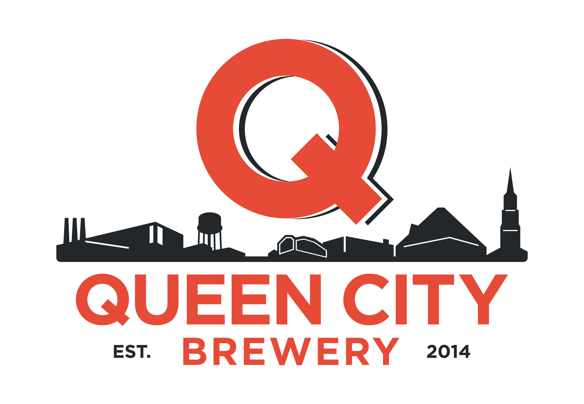
Logo Evolution


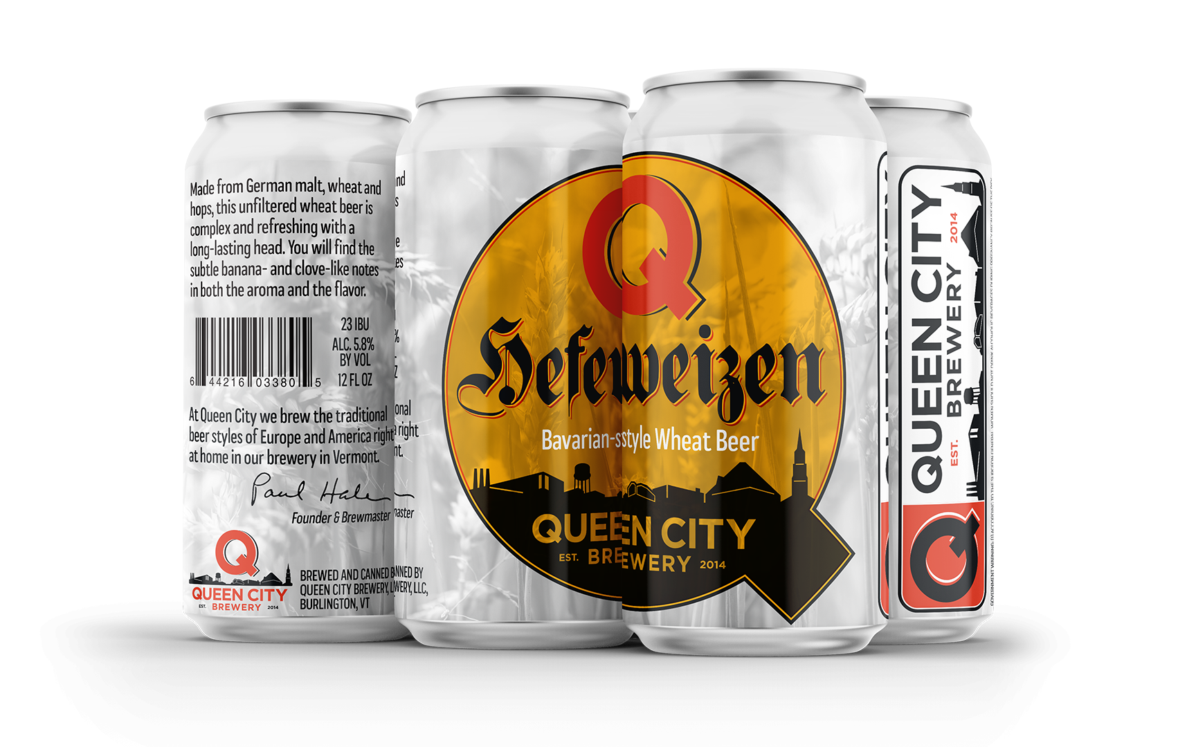
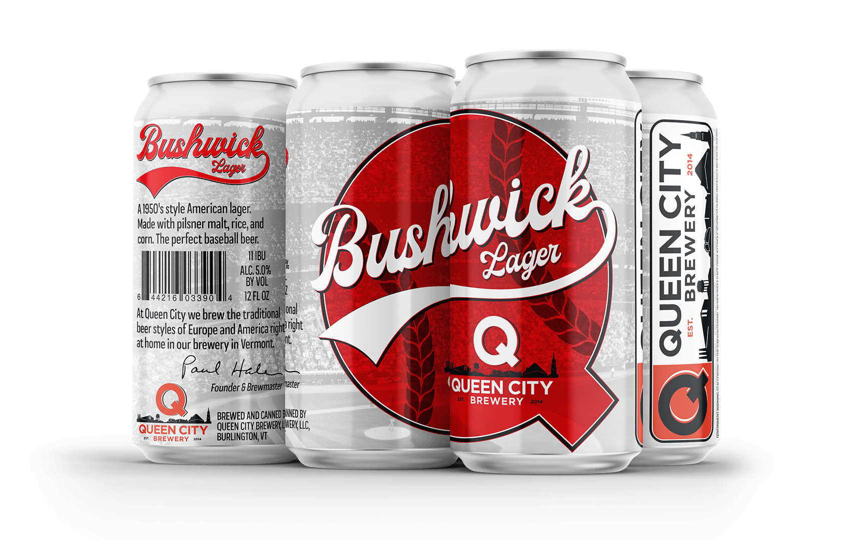
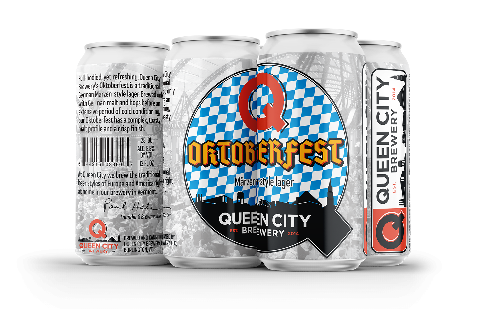
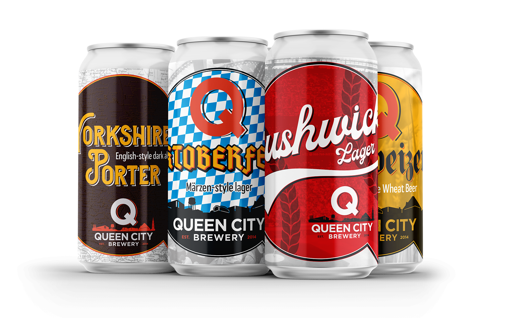
Labels/Packaging
Business Card